Understand your platform usage — tool calls, case throughput, and document type distribution
Analytics
The Analytics dashboard gives you a real-time view of your tenant's usage. Use it to track throughput, spot anomalies, monitor costs, and prepare for capacity planning.
Opening Analytics
Click Analytics in the sidebar. The dashboard loads with the last 7 days selected by default.
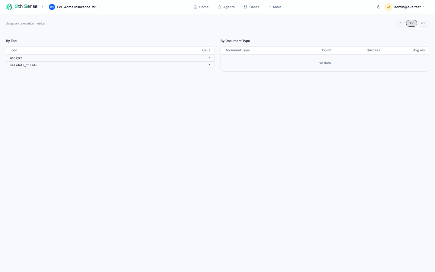 Analytics dashboard showing usage by action and By Document Type table with 7-day / 30-day / 90-day period selector
Date range filter
Use the date picker in the top-right to change the period. Presets: Last 7 days, Last 30 days, Last 90 days. For custom ranges, click the calendar icon and pick start and end dates.
All charts and totals update instantly when you change the range.
Metrics panels
Total tool calls
The number of individual processing steps (extractions, validations, checks, etc.) in the selected period. This is the primary billing metric.
The sparkline below the number shows daily volume so you can spot weekday/weekend patterns or traffic spikes.
Cases opened
The number of new cases created in the period. Compare this to tool calls to see your average tools-per-case ratio.
Cases completed
Cases that reached the completed state in the period. Subtract from cases opened to estimate backlog.
Avg. processing time
Median time from case creation to completed or review state. A rise here usually indicates a slow tool step — check the Executions tab on individual cases to identify the bottleneck.
Charts
Usage volume over time
A stacked bar chart showing daily processing volume, coloured by action (extraction, validation, checks). Hover over any bar to see the breakdown.
Use this chart to:
- Identify which actions are driving the most usage
- Spot sudden drops (possibly a bug in your backend) or spikes (a batch job)
Case status distribution
A pie chart showing the proportion of cases in each state (collecting, processing, review, completed) for the selected period. A large review slice means your review queue is growing faster than it's being processed.
Document type distribution
A horizontal bar chart showing which Document Types were analyzed most often. Useful for understanding which document verticals are most active and for auditing unexpected types appearing in your pipeline.
Top agents by case volume
A table listing your deployed agents ranked by number of cases opened in the period. Includes completion rate and avg. processing time per agent.
Filtering by agent
Use the Agent dropdown at the top of the page to scope all metrics and charts to a single agent. Useful when you have multiple agents serving different use cases and want per-agent analytics.
Export
Click Export CSV to download all visible data as a flat table. The CSV includes: date, tool name, agent goal, document type, case count, tool call count, avg. latency.
For programmatic access, use the Analytics API:
curl "https://api.9thsense.ai/v1/analytics/tool-calls?from=2026-01-01&to=2026-01-31" \
  -H "X-Api-Key: zk_read_..."
See the Analytics API reference for the full endpoint list.
Rate limits and quotas
Your current usage relative to your plan's monthly tool call quota appears in the top-right of the Analytics page. When usage reaches 80%, a warning banner appears. At 100%, new tool calls return 429 Too Many Requests.
Contact your account manager to raise your quota.